Advisor Planning Redesign
Summary
Decision Center is part of a web-based wealth management application that enables advisors to show clients how financial decisions impact financial plans in real time.
Goal
Enhance the planning experience by consolidating multiple planning tools into one seamless experience while retaining the functionality of the legacy product.
ROLE:
Lead UX Designer
User Research, Interaction, Visual design, Prototyping & Testing
Process
Enhance the planning experience by consolidating multiple planning tools into one seamless experience while retaining the functionality of the legacy product.
- Understanding of the problem
- Discovery & Ideation
- User flows and wireframes
- Visual design and iterations
- Prototype & usability testing
Discovery
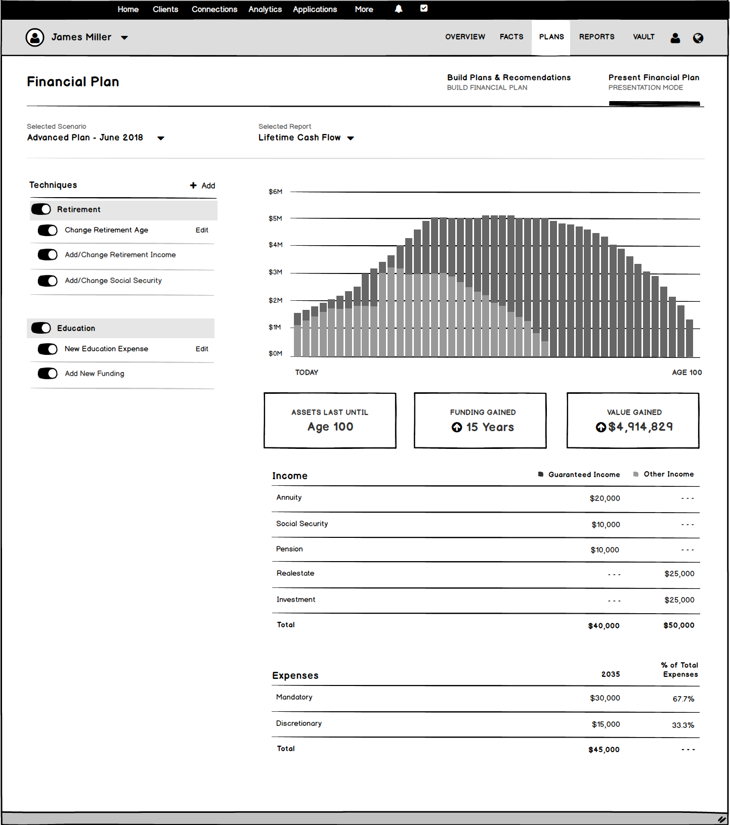
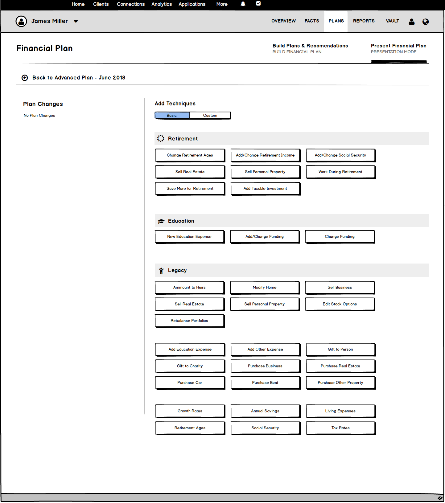
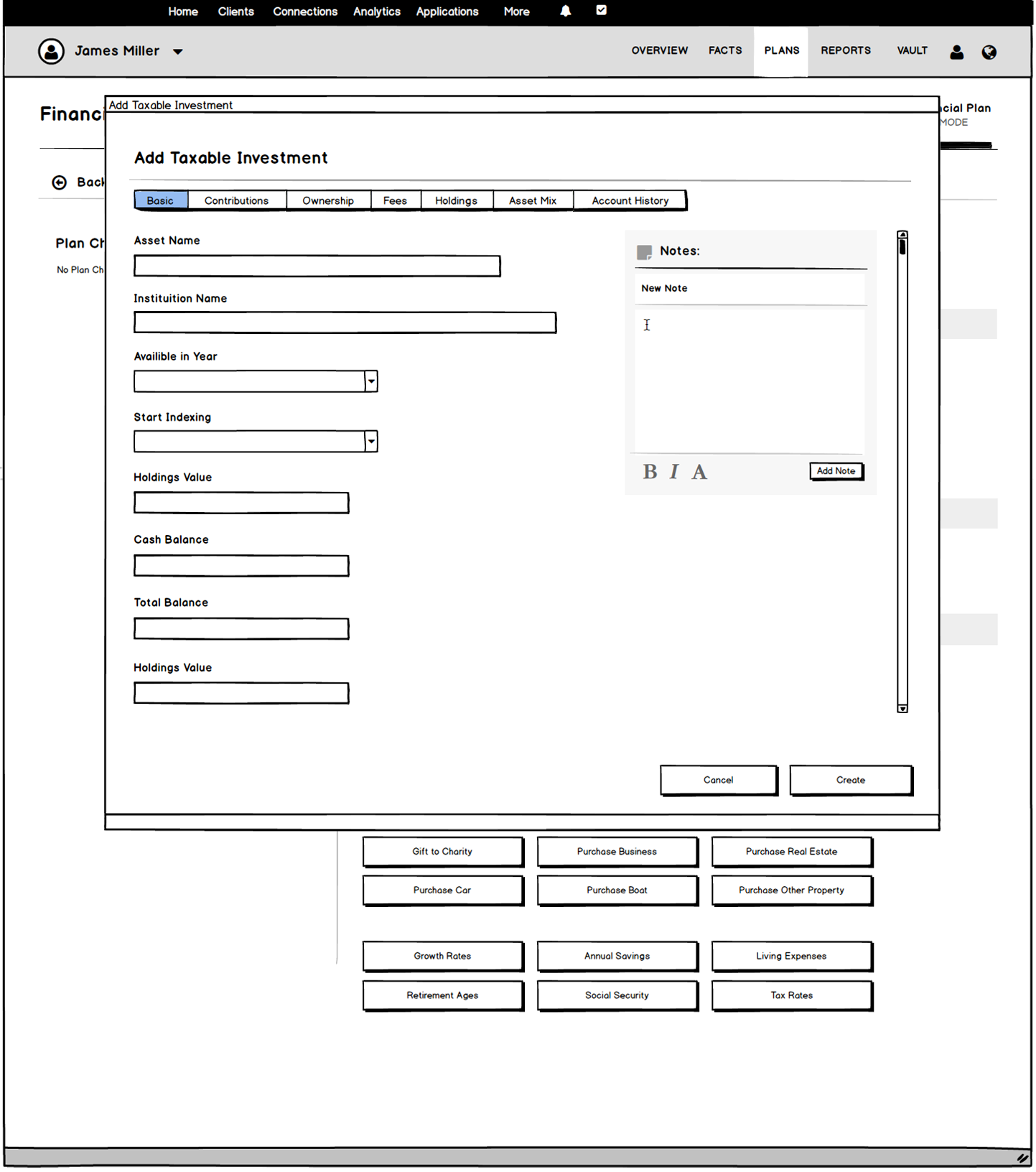
Sketches & Workflows
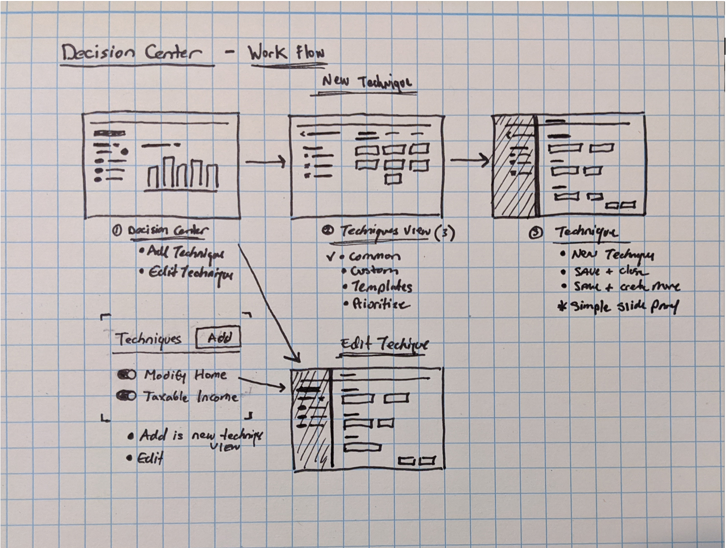
In order to handle adding complex, custom, and template techniques the UI needed to be in its own contextual view of techniques.
Problem Statement: “Users need a seamless, easy-to-use planning experience without sacrificing functionality”
We started by reviewing what was most important to our users based on top feature requests, user interviews, and aligning with business goals.
Next, I conducted a series of whiteboard sessions with stakeholders and subject matter experts to understand how users were currently working within the planning software and what difficulties they were running into.
User Quotes:
“Software is powerful but very complex and disjointed; it takes multiple steps to create techniques and view them in the decision center”
“It would be nice to create/use more complex techniques within decision center and save them as templates”
“Providing more visibility into plan changes within decision center would save me time and effort. I have to jump over to reports to check plans”
Discovery & Ideation
Working with a research partner, we started by reaching out to our existing users. We used surveys and interviews to learn more about user goals and pain points of working with our planning tools.
This provided us with enough information to define a problem statement, key user challenges and map the existing user experience.
Problem Statement
“Users need a seamless, easy to use planning experience without sacrificing functionality”
Ideation
I co-facilitated a one day ideation session with a cross functional team of UX, product and development with the goal of solving the following key user challenges:
Key user challenges
“... How might we improve non-intuitive workflows?”
“... How might we minimize the effort of building techniques?”
“... How might we provide more visibility into plan changes?”
Workflows & Wireframes
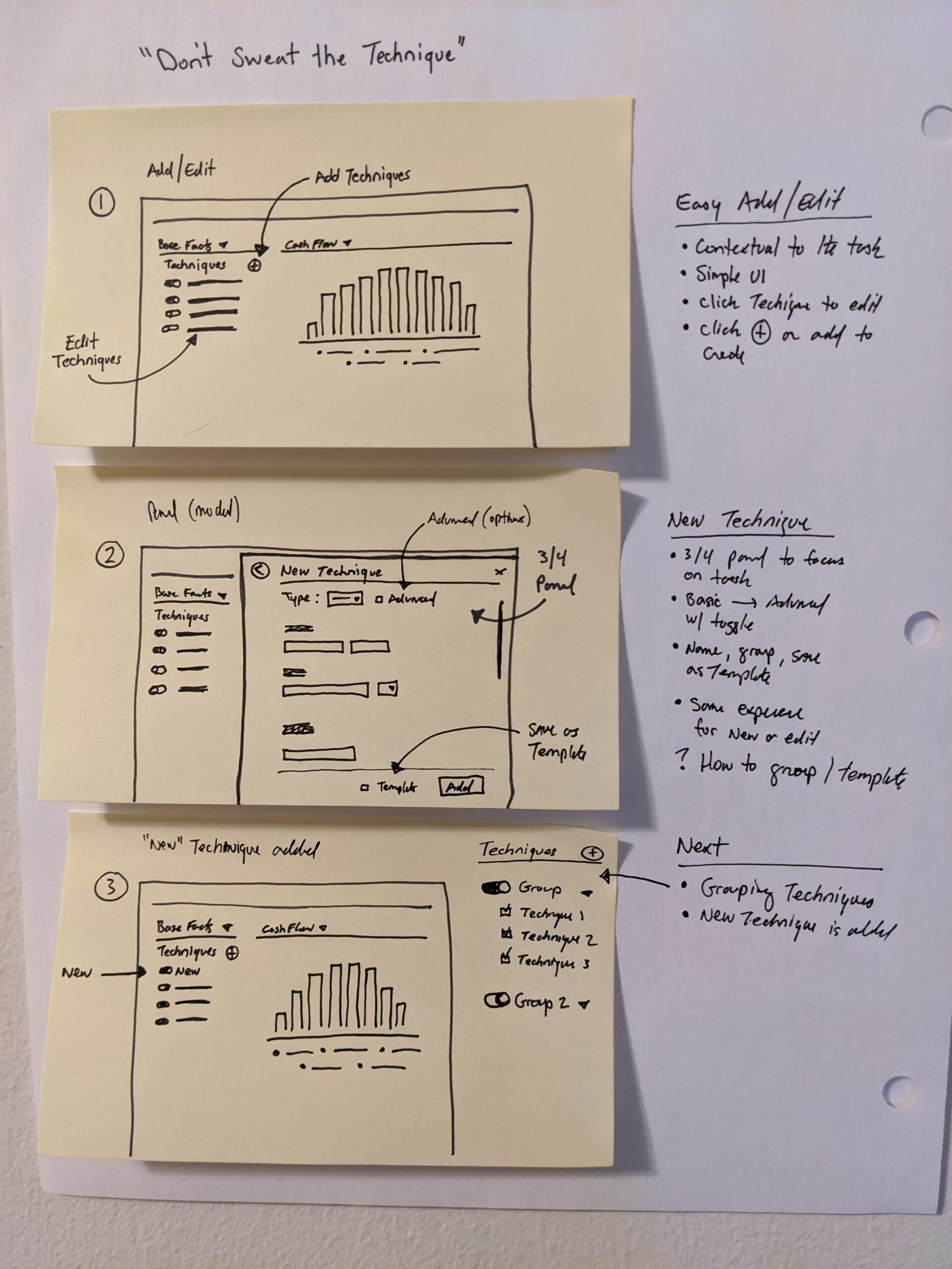
Created user flows and wireframes of key screens shared with stakeholders, and iterated based on feedback until it was time to go high-fidelity.
Sketches & Workflows
In order to handle adding complex, custom, and template techniques the UI needed to be in its own contextual view of techniques.
Visual Design & Solutions
Created visual design in Sketch and prototype in Invision. Validated the design by conducting moderated user walkthroughs both online and in-person at our 2019 Summit.
Charts
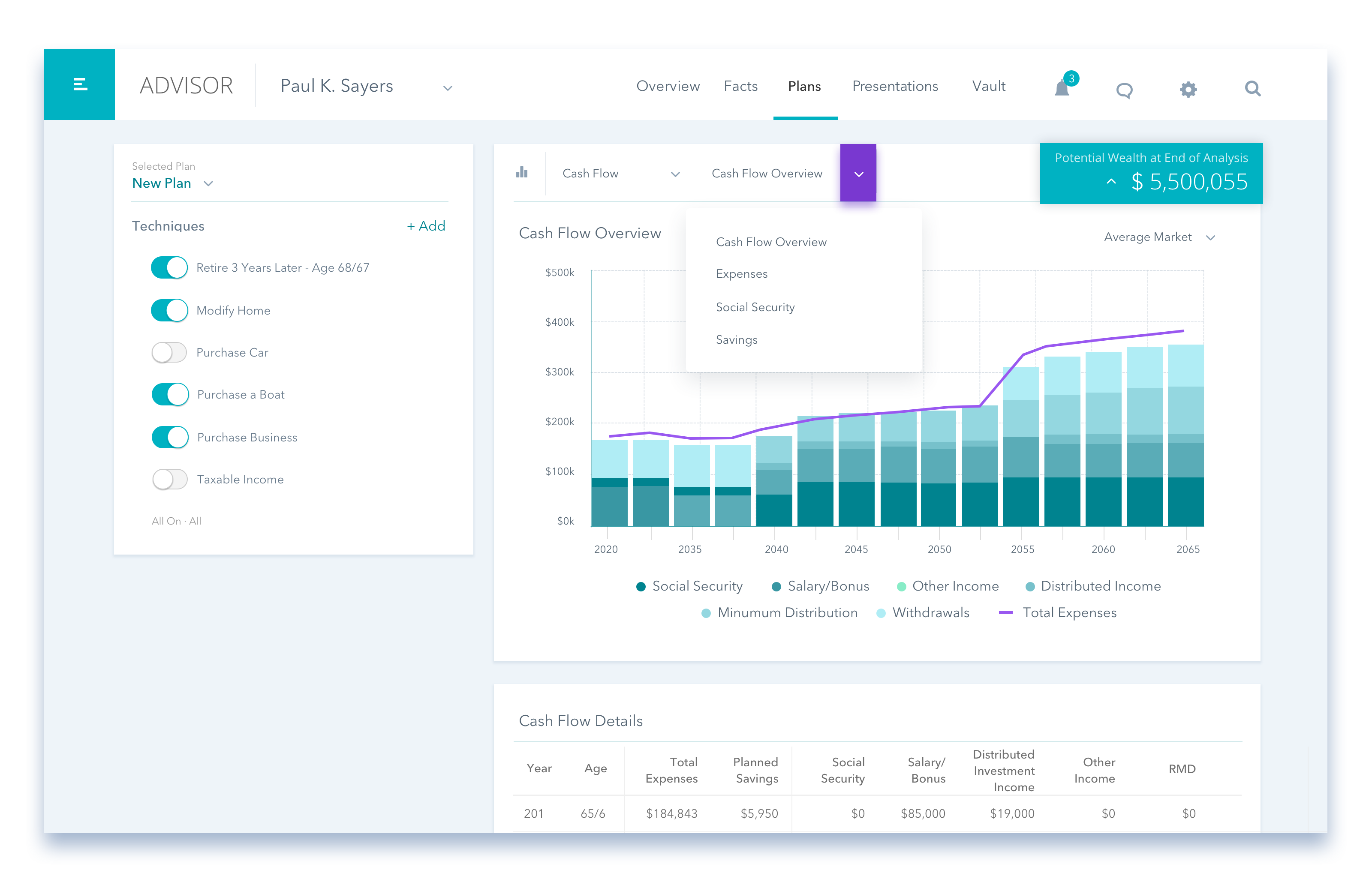
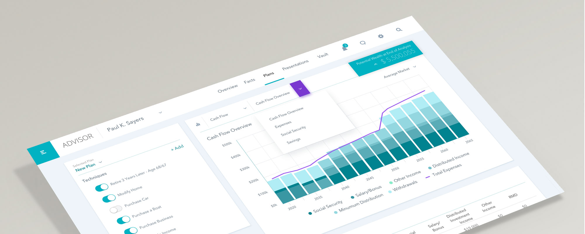
Expanded the charts section of decision center to bring in the most used reporting charts to bring more plan insights into the experience. This reduced the friction of leaving decision center to review plan impacts in reports, which was about 3 steps away.
Techniques
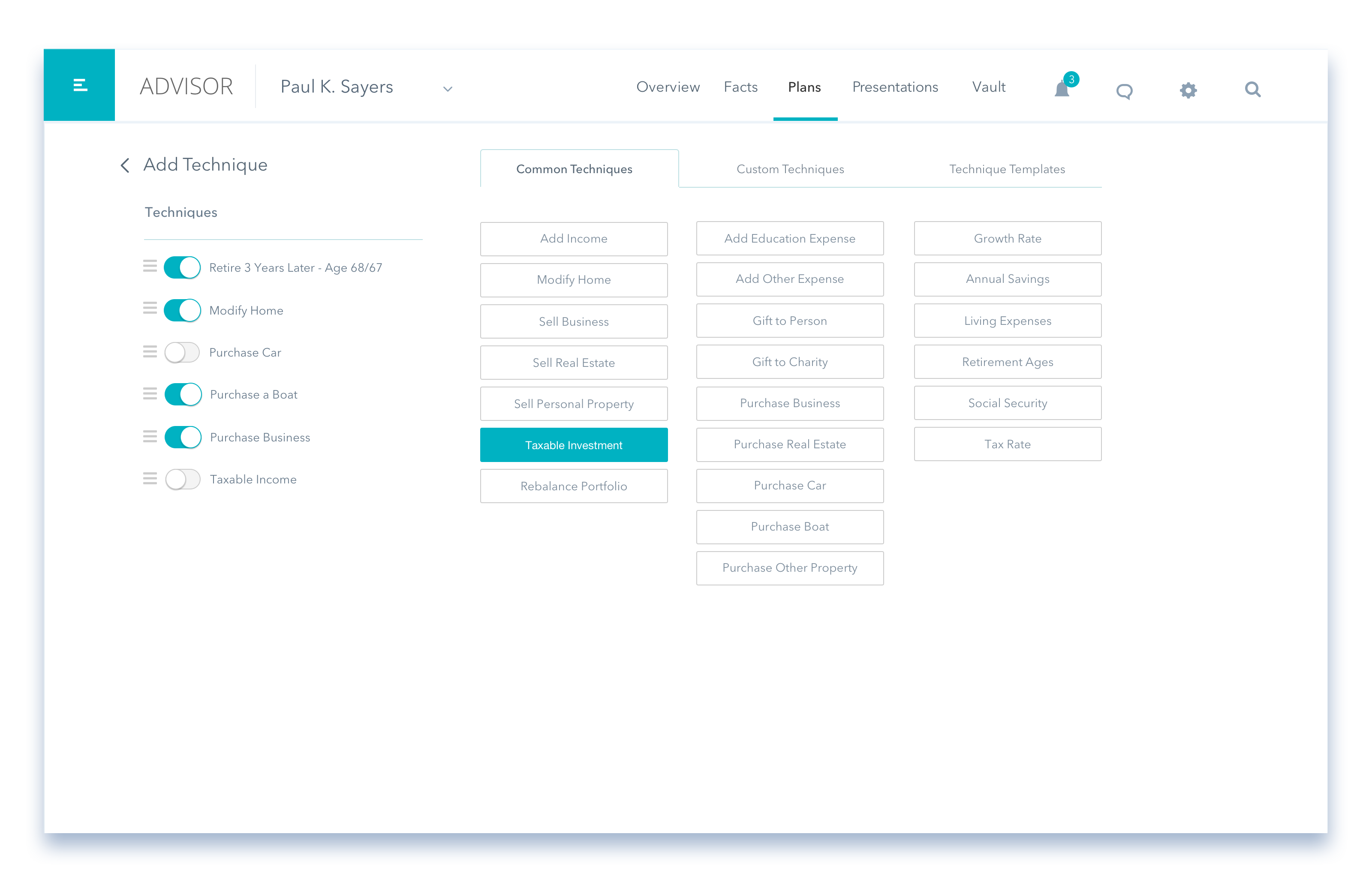
Expanded the techniques area of the application to handle more complex techniques. This included redesigning how users edit techniques, adding advanced technique building through the custom tab, and the ability to create and save technique templates.
New Techniques Screen
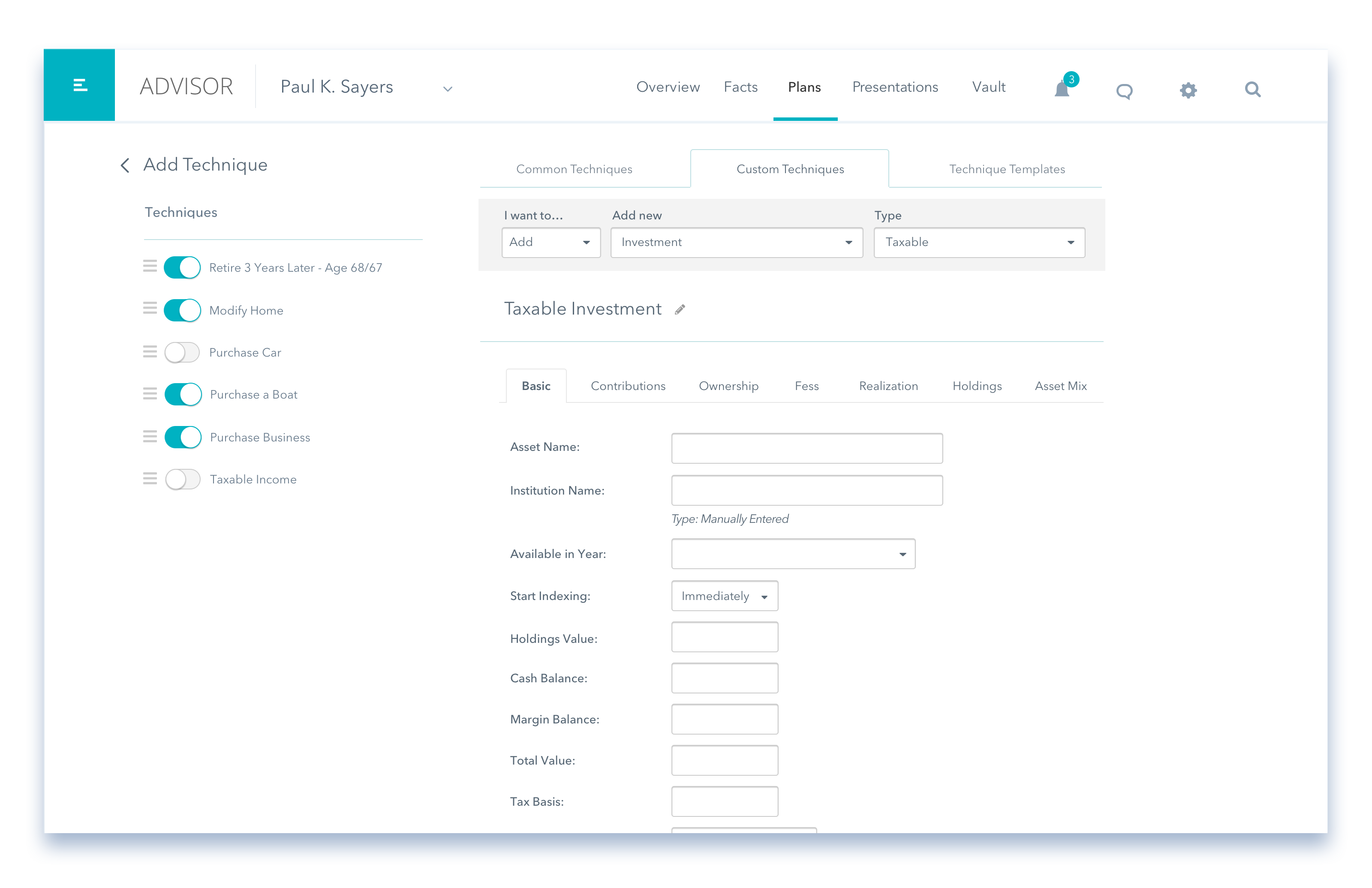
I created a new technique focused page to bring advanced technique options into decision center. This allowed us to add custom techniques and technique templates in a contextual view that doesn’t feel like the user left the planning experience.
Enhancing Techniques
In order to handle adding complex, custom, and template techniques we needed to give techniques its own page to build upon.
Adding a Custom Technique
Bringing in the advanced techniques experience through the custom tab allowed me to remove the frustration of jumping around the app without changing the core functionality.
Adding a Common Technique
Using a side panel to bring more complex technique functionality we were able to eliminate the frustration of jumping around for the user.
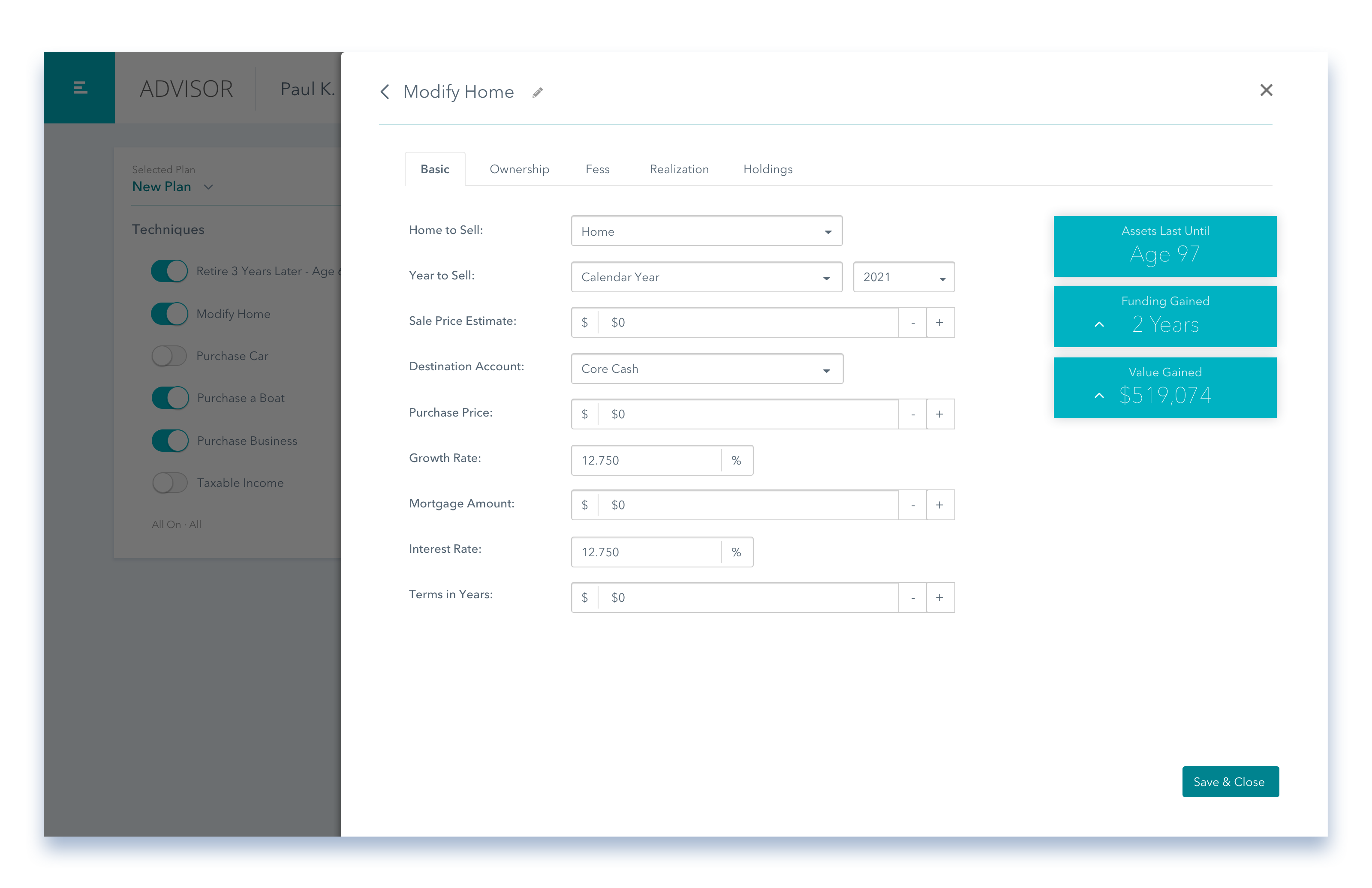
Editing A Technique
To handle the more complex technique options I had to rethink how we edit techniques. I moved the editing to a 3/4 slide-out drawer. This allowed us to keep the more advanced options as tabs, essentially bringing the advanced techniques experience into decision center.
Adding a Common Technique
Using a side panel to bring more complex technique functionality we were able to eliminate the frustration of jumping around for the user.
Outcome
Created visual design in Sketch and prototype in Invision. Validated the design by conducting moderated user walkthroughs both online and in-person at our 2019 Summit.
Usability Testing
Phase 1: We brought a hi-fidelity prototype to the 2019 summit UX labs and let advisors walk through the demo. Feedback gathered was later used to further iterate on the feature.
Phase 2: Using feedback from the summit we iterated on the prototype and tested on 10 users (moderated) to validate our hypotheses. We used a previously defined script to guide users through our prototype.
What We Learned
We observed almost entirely positive feedback. Most users loved the technique updates and felt it was a major improvement to the workflow. Based on the findings from user testing sessions we were able to come up with a list of changes and improvements.

Interested in working together? Get in touch!
©2024 Joseph Neville - UX Leader & Designer

